how to create a gantt chart in google sheets, you need to step back and look at what the chart actually represents.
- 1. Setting Up Your Task Data
- 2. Establishing the Base Date
- 3. Calculating Start Day Offset
- 4. Creating the Stacked Bar Data
- 5. Inserting the Chart
- 6. Adjusting the Chart Setup
- 7. Hiding the Offset Series
- 8. Formatting the Timeline Axis
- 9. Implementing Conditional Formatting for Progress
- 10. Using Today’s Date Indicator
- 11. Advanced Formatting and Best Practices
- You May Also Like:
- Frequently Asked Questions
It is a visual project schedule, plain and simple, taking your task list and overlaying a timeline.
Most people jump straight into fancy software, which is fine, but for quick, collaborative, and free project visualization, Google Sheets is often the smarter starting point.
It requires a bit of clever formatting and function use, but the barrier to entry is almost zero.
We are talking about mapping out dependencies, tracking task durations, and giving your team a clear line of sight on the entire project flow, all within a familiar spreadsheet environment.
The real power is in its immediate shareability and the fact that you already use it for so many other things.
Knowing how to create a gantt chart in Google Sheets is a core skill for any project manager operating on tight budgets or small teams.
1. Setting Up Your Task Data
The very first step is to get the raw data laid out cleanly. Without this structure, nothing else works.
You need four core columns at a minimum. You need the Task Name, obviously. Then you need a Start Date and an End Date.
The fourth critical column is the Duration of the task, usually expressed in days.
It is helpful to add a fifth column for the Percentage Complete, but we can get to that later for the visual progress tracking.
For now, focus on the first four.
List your tasks in column A, the start dates in column B, end dates in column C, and then the duration in column D.
Use the actual date format. Do not type something like “Jan 1st” and expect Google Sheets to treat it as a calculation value.
It needs to be a proper date, like 12/16/2025.
I always suggest having a column for Predecessors as well, but for the basic chart structure itself, it is not strictly required. It just makes the project logic much clearer down the road.
If you are just learning how to create a gantt chart in Google Sheets, stick to the basics first.
2. Establishing the Base Date
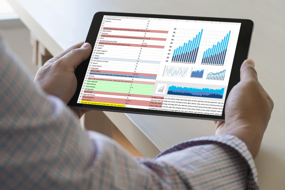
This is a step people often overlook, and it throws off all their calculations.
You need to define the absolute project start date. This is the zero point for your chart’s timeline.
Find the earliest date in your Start Date column. That is your Base Date.
Place this date in a separate cell, say G1, and maybe label it Project Start. This is important because every task start position on the chart will be a calculation of how many days it occurs after this Base Date.
The time difference between a task’s start date and the project’s overall start date gives us the initial spacing for the bar on the chart.
If you skip this, your whole chart will be based on arbitrary date values that do not align visually.
It is a simple step, but it is the foundation for the visual alignment of the timeline.
3. Calculating Start Day Offset
Now we need to calculate the actual distance in days from the Base Date for every single task.
This will be the first numerical series we use in our stacked bar chart.
In a new column, say E labeled Start Day Offset, enter a formula. For the first task, it would be something like =B2 – G1.
Remember B2 is the task’s Start Date and G1 is the Project Start Base Date.
This subtraction gives you a number. That number represents the number of days the task’s bar should be indented or offset from the left edge of the chart.
When you copy this formula down for all your tasks, remember to use absolute referencing for the Base Date cell, so =B2 – $G$1.
This locks the reference to G1 as you drag the formula down the column.
This column of numbers is what the first color in your stacked bar chart will be based on. It is the invisible part of the bar that positions the actual task duration.
4. Creating the Stacked Bar Data

The magic of how to create a gantt chart in Google Sheets using the default chart function relies entirely on the stacked bar chart type.
You are creating two data series stacked on top of each other, but only one is visible.
We already have the first series: the Start Day Offset from step 3. That is the invisible space.
The second series is the Duration from column D. That is the actual task bar length.
These two numerical columns, Start Day Offset and Duration, are the only columns needed to physically draw the Gantt bars.
Make sure these two columns are right next to each other, or at least that you are selecting them correctly. For clarity, it is best to place your Task Names, the offset, and the duration all together.
For example, A for Tasks, E for Offset, and D for Duration.
This specific data arrangement is crucial before moving into the chart creation tool. I cannot stress that enough. People try to include the dates and other text columns, which just breaks the chart function.
5. Inserting the Chart

With the data selected, it is time to insert the chart.
Highlight the Task Names column (A) and your two numerical columns (Start Day Offset (E) and Duration (D)).Go to the Insert menu and select Chart.
Google Sheets will try to guess what kind of chart you want. It is usually wrong.
On the Chart Editor panel that pops up, you need to change the Chart Type.
Scroll down and select the Stacked Bar Chart. This is the key.
Immediately, you will see a set of horizontal bars. They might look strange at first, but this is the Gantt structure taking shape.
The tasks will likely be listed on the vertical axis, and the numbers representing days on the horizontal axis.
You might notice the order of your tasks is reversed. Do not worry about that yet; it is a simple fix in the customization step.
6. Adjusting the Chart Setup
We need to make a few quick changes in the Setup tab of the Chart Editor.
First, make sure the X-axis is correctly using your numerical data and the Y-axis is using your Task Names.
Next, under the Setup tab, look for the option that says Switch rows/columns or something similar. Depending on how you selected the data, you might need to toggle this.
More importantly, look for Aggregate and make sure it is unchecked. Aggregating the data will mess up the individual bar lengths.
Also, check the box for Use column A as labels. This ensures your Task Names are used correctly for the Y-axis labels.
Lastly, and this is the fix for the reversed order, go to the Customize tab, select Vertical Axis, and check the box for Reverse axis order. This puts your tasks in the logical top-to-bottom order you defined in your spreadsheet.
7. Hiding the Offset Series
This is the most critical visual step in how to create a gantt chart in Google Sheets. You need to make the Start Day Offset bars disappear.
Go to the Customize tab in the Chart Editor.
Select Series. In the dropdown menu, select the first data series, which should correspond to your Start Day Offset column.
Change the Color to None or white, depending on your chart’s background. I prefer using None if it is an option, but a clear white is often the safer bet.
As soon as you do this, the bars for the offset disappear, leaving the Duration bars positioned correctly along the timeline.
This is the moment the visualization goes from a generic stacked bar chart to a functioning Gantt Chart.
You now have task bars starting at the correct day offset from the project start date.
8. Formatting the Timeline Axis
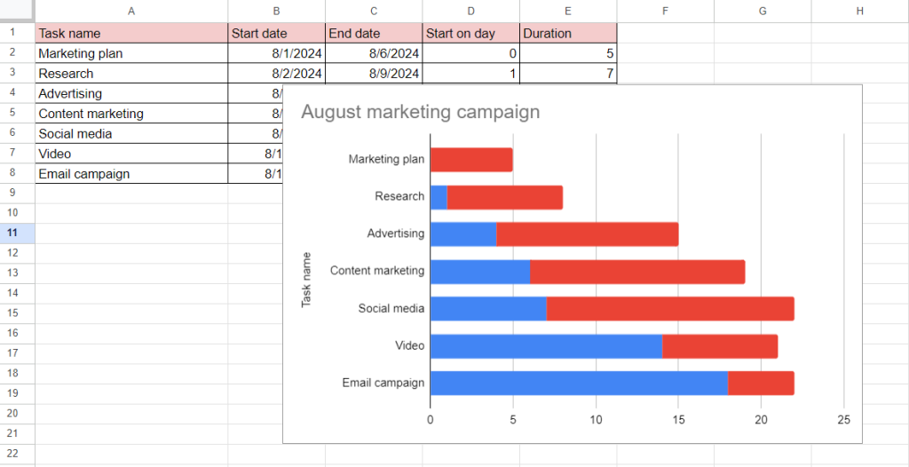
The horizontal axis, or the X-axis, currently shows just a number of days, which is correct mathematically, but not ideal for human readers.
You need to give it more context. Go to the Customize tab and select Horizontal Axis.
You can adjust the Min and Max values if you want to zoom in on a specific part of the project timeline. Setting the Min to 0 is usually best.
Then, change the axis label formatting. You can add a title like “Days Since Project Start” to make it perfectly clear.
For a better visual representation, you might want to adjust the Major Gridlines setting.
If your tasks are very short, maybe put a major gridline every 5 days. If the project spans months, maybe every 10 or 20 days is better.
The goal here is readability. You want someone to look at the chart and immediately grasp the task length and its timing.
9. Implementing Conditional Formatting for Progress

A static Gantt chart is only so useful. To make it a living document, you need to show progress. This is where we use conditional formatting, but not on the chart itself. We do it in the sheet and then visualize the results.
First, you need the Percent Complete column, let’s say column F.
Next, you need a calculated column for the Completed Duration. This is Duration∗Percent Complete. If D2 is Duration and F2 is Percent Complete, the formula would be =D2 * F2.
You also need a column for the Remaining Duration. This is Duration−Completed Duration. Or just =D2 * (1 - F2).Now your stacked bar chart needs to include three series: Start Day Offset, Completed Duration, and Remaining Duration.
You add these two new columns to your chart data range.
In the Customize series, color the Start Day Offset white as before.
Color the Completed Duration a solid, darker color, say a deep blue.
Color the Remaining Duration a lighter, less saturated color, like a light grey or a pale blue.
As you update the Percent Complete in column F, the bar in the chart visually divides, showing the actual progress completed versus the remaining work.
This is a very powerful technique for how to create a gantt chart in Google Sheets with dynamic progress tracking.
10. Using Today’s Date Indicator
A great project visualization tool needs a way to show where the project stands in relation to the current date. Without it, you are looking at a history book.
You cannot draw a vertical line easily inside the standard Google Sheets chart. But there is a smart workaround using a third-party tool’s concept.
You create a small data set outside your main one. It needs to be a single data point.
In a cell, calculate the number of days between your Base Date (G1) and TODAY(). The formula would be =TODAY() - $G$1.This single value is your Today’s Offset.
You then insert this as a separate data series on your Gantt chart. You might have to select the chart, go to Setup, and add this single cell as an additional series.
In the Customize series menu, format this new series as a very thin line or a marker at the top of the chart, if possible. If not, you are limited, but the number gives you the coordinate.
A more effective but slightly more complex method is to add a new column to your sheet and put this Today’s Offset number only for the first task, and put a zero for the duration. This might force Google Sheets to draw a small, thin vertical line.
The cleaner approach is simply to manually draw a line on the chart overlay in an image editor after exporting it, but for a live sheet, having the Today’s Offset number visible is the best you can do within the standard function set.
You can also use a formula in a separate cell that calculates if a task is currently scheduled to be active, using =IF(AND(TODAY() >= Start Date, TODAY() <= End Date), "Active", "") and then using that output in a custom color rule for the task name cells.11. Advanced Formatting and Best Practices

Once you have the structure of how to create a gantt chart in Google Sheets down, you move to refinement.
Always, always clean up the cosmetic details. Remove the chart title if it is redundant. Get rid of the legend if you only have one visible color.
Make sure your Task Names are short and descriptive. If they are too long, the chart gets squished.
Color Coding: Use color not just for progress, but for meaning. Maybe all Milestones are a solid green. Maybe all tasks handled by the Engineering team are blue, and Marketing tasks are orange. Use a consistent color palette across all your project visuals.
Dependencies: You cannot draw dependency arrows directly in a Google Sheets chart like you can in dedicated project software.
The workaround is to create a TEXT() column next to your task names that explicitly lists the preceding task’s number. For example, “Task 4 (Depends on 3)”. This is a clear, low-tech way to handle the logic.
Data Validation: Protect your core date cells. Use Data Validation to ensure that people can only enter valid dates into the Start and End date columns.
This prevents calculation errors down the line. I always lock the Base Date cell; too many people accidentally delete or change it, breaking the entire chart.
Remember, this chart’s effectiveness is tied to the underlying data accuracy. Garbage in, garbage out. You need a process for updating the Start, End, and Percent Complete columns regularly.
A Gantt Chart is a management tool, not a static report. It requires maintenance.
As a matter of fact, the Project Management Institute has countless papers on the efficacy of visual schedule communication.
A good Gantt chart, regardless of the tool, is shown to improve team alignment significantly.
It is about transparency, and the simple nature of the Google Sheets tool means everyone can access and understand it without special training.
A final note on data structure. I personally prefer keeping all the calculation columns hidden once the chart is finalized. Select columns E through J, right click, and select Hide columns.
This keeps the sheet clean, presenting only the core Task data and the beautiful chart. It keeps the complexity under the hood, showing the team only what they need to see.
You May Also Like:
- How to Use Jira in 7 Steps That Make Project Tracking Simple
- How to Create a Gantt Chart in 5 Simple Steps Anyone Can Use
- How to Become a Project Manager From Beginner to Leader
Frequently Asked Questions
What are the essential columns needed to create a Gantt Chart in Google Sheets?
To understand how to create a gantt chart in Google Sheets, you minimally need four columns: the Task Name, the Start Date, the End Date, and the calculated Duration in days. You also absolutely must calculate a Start Day Offset column, which measures the days from the project’s start date; this is the key to correctly positioning the bar on the timeline.
Why do I need a Stacked Bar Chart for the Gantt Chart?
You use a stacked bar chart because it allows you to combine two data series to form one visual element. The first series is the Start Day Offset, which you make invisible by coloring it white. This acts as the required padding or space from the timeline’s zero point. The second series is the Duration, which remains visible and forms the actual task bar, correctly positioned due to the hidden offset.
Can I track task progress on a Google Sheets Gantt Chart?
Yes, you can track progress dynamically. After learning how to create a gantt chart in Google Sheets, you add a Percent Complete column. This lets you calculate a Completed Duration and a Remaining Duration. By including these two new data series in your stacked bar chart and coloring them differently, the task bar visually splits to show the completed portion versus the remaining work.


